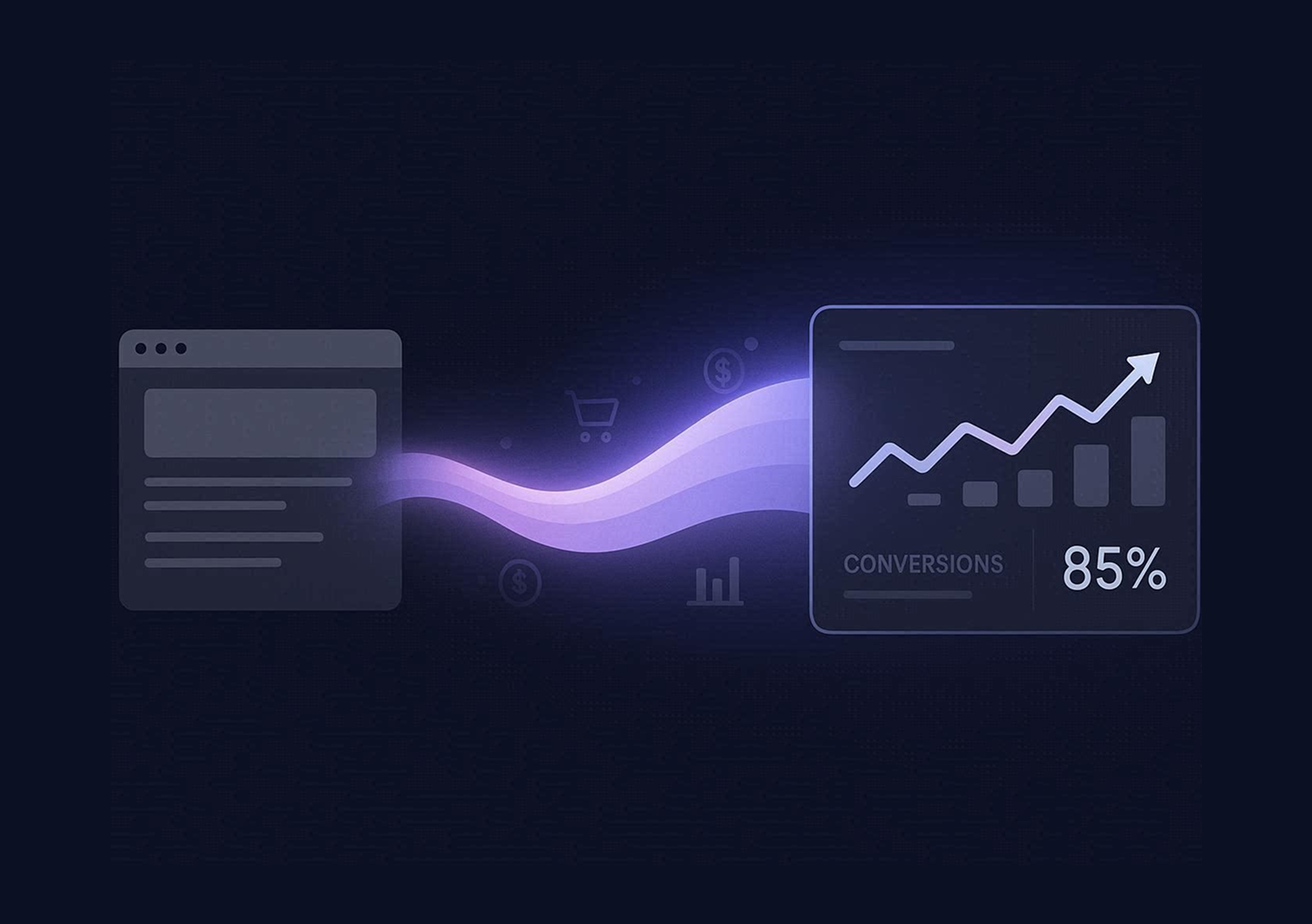


Website Mistakes Killing Conversions
Your website looks good but isn't converting? These 10 common mistakes are silently killing your sales. Learn how to identify and fix each one with actionable solutions that actually work.

- No clear CTA is the most common and most fixable conversion killer — every page needs one primary action
- 53% of mobile users abandon sites that take longer than 3 seconds — speed is a revenue issue, not a technical one
- Generic, self-centered messaging loses visitors immediately — lead with benefits and outcomes, not features and credentials
- Trust signals (testimonials, logos, reviews) need to appear before decision points, not buried at the bottom
- Analytics without action is worthless — data only creates value when it drives specific improvements
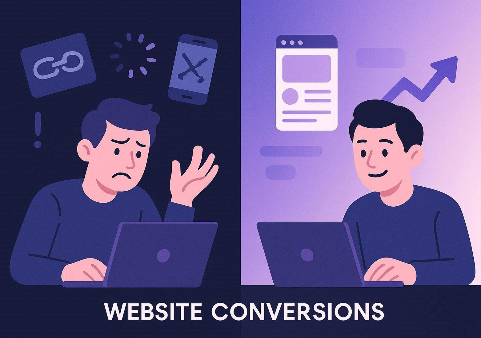
10 Website Mistakes That Are Killing Your Conversions (And How to Fix Them)
Your website looks professional. The colors match your brand. The copy sounds polished. But something's wrong. Traffic comes in, visitors scroll around, and then they leave. No contact form submissions. No calls. No sales.
You're not alone. Most business websites make the same conversion-killing mistakes. The difference between a website that generates leads and one that doesn't often comes down to a handful of fixable issues that most business owners don't even realize exist.
This guide walks through the ten most common website mistakes that silently kill conversions, explains why they hurt your business, and shows you exactly how to fix them. If your website isn't performing the way it should, one or more of these issues is likely the culprit.
Mistake #1: No Clear Call to Action
The Problem
Visitors land on your homepage and... then what? If your website doesn't explicitly tell people what to do next, they won't do anything. Humans need direction. Without a clear, compelling call to action, even interested prospects will browse aimlessly and leave.
The mistake shows up in several ways:
- No visible CTA buttons above the fold
- CTAs buried at the bottom of long pages
- Vague language like "Learn More" or "Click Here"
- Too many competing CTAs creating decision paralysis
- Different CTAs on every page with no consistent conversion path
Why It Kills Conversions
Decision fatigue is real. When visitors don't know what step to take, they take no step at all. Research from the Nielsen Norman Group shows that clarity reduces friction and increases action. Websites with clear, singular CTAs convert significantly better than those with multiple options competing for attention.
How to Fix It
Pick One Primary Action Per Page: Every page should have one main goal. Homepage? Get them to book a call. Service page? Request a quote. Blog post? Download a resource. Design everything around that single objective.
Use Action-Oriented Language: Replace generic phrases with specific, benefit-driven CTAs:
- Instead of "Learn More" → "Get Your Free Strategy Session"
- Instead of "Submit" → "Start Saving Money Today"
- Instead of "Contact Us" → "Book a 15-Minute Call"
Position CTAs Strategically:
- Above the fold (visible without scrolling)
- After key benefit sections
- At the end of service descriptions
- As a sticky element that follows scroll
- In the navigation menu for easy access
Make Them Visually Prominent: Use contrasting colors, generous white space, and button sizing that makes CTAs impossible to miss. Test different button colors—sometimes a simple color change increases conversions by 20-30%.
Mistake #2: Slow Page Load Speed
The Problem
Your website takes four, five, six seconds to load. Visitors stare at a white screen or a loading spinner. By the time your hero section appears, half of them are gone. Speed isn't just a user experience issue—it directly impacts revenue.
Research consistently shows:
- 53% of mobile users abandon sites that take longer than 3 seconds to load
- A one-second delay in page load time reduces conversions by 7%
- Amazon found that every 100ms of latency costs them 1% in sales
Why It Kills Conversions
Slow sites signal poor quality. Users subconsciously associate speed with professionalism and reliability. A fast site feels trustworthy. A slow site feels sketchy, outdated, or broken—even if your actual product or service is excellent.
Beyond perception, speed is a Google ranking factor. Slow sites rank lower in search results, which means less organic traffic reaching your site in the first place.
How to Fix It
Compress Images: Large, unoptimized images are the #1 culprit. Use tools like TinyPNG, Squoosh, or ImageOptim to reduce file sizes without visible quality loss. Convert images to next-gen formats like WebP or AVIF.
Enable Caching: Browser caching stores static files locally so returning visitors don't have to download everything again. Most hosting providers offer caching plugins or built-in solutions.
Minimize HTTP Requests: Every script, stylesheet, and image requires a separate server request. Combine files where possible and eliminate unnecessary third-party scripts.
Use a Content Delivery Network (CDN): CDNs distribute your site's files across global servers so content loads from the location closest to each visitor. Platforms like Webflow include CDN by default.
Choose Better Hosting: Shared hosting is cheap but slow. Upgrade to managed hosting or a platform with built-in performance optimization.
Test Your Speed: Use Google PageSpeed Insights, GTmetrix, or WebPageTest to identify specific bottlenecks and track improvements over time.
Mistake #3: Poor Mobile Experience
The Problem
Over 60% of web traffic comes from mobile devices, yet many websites still treat mobile as an afterthought. Tiny text that requires zooming. Buttons too small to tap accurately. Horizontal scrolling. Broken layouts. Forms that don't work on touchscreens.
If your mobile experience is frustrating, you're losing the majority of your potential customers.
Why It Kills Conversions
Mobile users are often high-intent. They're searching for solutions on the go—looking for a restaurant, booking a service, comparing products. If your site doesn't work seamlessly on mobile, they'll find a competitor's site that does.
Google also uses mobile-first indexing, meaning your mobile site determines your search rankings. A poor mobile experience hurts both conversions and visibility.
How to Fix It
Use Responsive Design: Your site should automatically adapt to different screen sizes. Platforms like Webflow build responsiveness in from the start, but test on real devices to catch issues.
Optimize Touch Targets: Buttons and links should be at least 48x48 pixels. Smaller targets lead to misclicks and frustration.
Simplify Navigation: Mobile menus should be clean and easy to use. Hamburger menus work, but make sure your most important links are easy to access.
Increase Font Sizes: Body text should be at least 16px on mobile. Anything smaller is hard to read without zooming.
Test Forms on Mobile: Multi-field forms often break on mobile. Use auto-complete, minimize required fields, and ensure keyboard types match input (numeric keyboard for phone numbers, etc.).
Prioritize Speed on Mobile: Mobile networks are slower than WiFi. Compress aggressively and eliminate non-essential elements on mobile views.
Mistake #4: Confusing Navigation
The Problem
Visitors can't find what they're looking for. Your menu has 12 top-level items. Dropdown menus have nested sub-menus three levels deep. Page names are vague or industry jargon-heavy. There's no logical flow from one section to another.
Confusing navigation frustrates users and increases bounce rates.
Why It Kills Conversions
If visitors can't find your pricing, services, or contact information within 5-10 seconds, they leave. Navigation should be invisible—users shouldn't have to think about it. When navigation becomes a puzzle, you've lost them.
How to Fix It
Limit Top-Level Menu Items: Stick to 5-7 main navigation links. Group related pages under clear category labels.
Use Descriptive Labels: "Services" is clear. "Solutions" is vague. "What We Do" is confusing. Use plain language that matches what visitors are searching for.
Add a Search Bar: For content-heavy sites, a search function helps users find specific information quickly.
Include a Sticky Header: Keep navigation accessible as users scroll down the page.
Create a Logical Hierarchy: Organize pages by importance and user journey. Homepage → Services → About → Contact is a standard flow for a reason—it matches how people research and make decisions.
Test with Real Users: Ask someone unfamiliar with your business to find specific information on your site. Watch where they struggle.
Mistake #5: Weak or Missing Trust Signals
The Problem
Your website provides no evidence that you're credible, reliable, or worth doing business with. No testimonials. No client logos. No case studies. No reviews. No social proof.
Visitors have no reason to trust you over competitors who clearly demonstrate their track record.
Why It Kills Conversions
Online transactions require trust. Visitors are deciding whether to give you their contact information, their credit card, or their business. Without proof that others have done the same successfully, they won't take the risk.
Research from BrightLocal shows that 88% of consumers trust online reviews as much as personal recommendations. Social proof isn't optional—it's a conversion requirement.
How to Fix It
Add Client Testimonials: Feature specific, detailed testimonials that mention results, not just generic praise. "Increased our leads by 40%" is more credible than "Great to work with."
Display Client Logos: If you've worked with recognizable brands, show their logos prominently.
Showcase Reviews: Embed Google reviews, Trustpilot ratings, or industry-specific review platforms.
Create Case Studies: Detailed success stories with before/after metrics build credibility and demonstrate ROI.
Add Trust Badges: SSL certificates, payment security icons, industry certifications, and awards signal professionalism.
Show Real Photos: Use actual team photos and real project images instead of generic stock photography. Authenticity builds trust.
Mistake #6: Too Much Clutter
The Problem
Your homepage tries to say everything at once. Twenty different messages. Fifteen links above the fold. Animated sliders. Pop-ups. Chat widgets. Banners. Social feeds. Every section fighting for attention.
The result is overwhelming, visually chaotic, and impossible to scan.
Why It Kills Conversions
Cognitive load kills conversions. When visitors are bombarded with information and options, their brains shut down. Decision paralysis sets in. Instead of choosing one action, they choose none and leave.
Research from the CXL Institute found that reducing page elements by 40% can increase conversions by up to 30%. Less is genuinely more.
How to Fix It
Embrace White Space: Empty space around elements makes them more impactful, not less. Don't feel compelled to fill every pixel.
Limit Homepage Messages: Pick 3-5 key points and organize them hierarchically. Not everything deserves equal emphasis.
Remove Unnecessary Elements: Audit every element on your page. If it doesn't directly support your conversion goal, remove it.
Use Visual Hierarchy: Size, color, and position signal importance. Make sure your most important elements are the most prominent.
Simplify Forms: Ask for the minimum information needed. You can always collect more data later.
Mistake #7: Generic, Self-Centered Messaging
The Problem
Your website talks endlessly about how great you are. "We're the leading provider." "We've been in business for 20 years." "We offer comprehensive solutions."
The problem? Visitors don't care about you. They care about themselves and their problems.
Why It Kills Conversions
People visit your website asking "What's in it for me?" If your messaging doesn't immediately answer that question, they bounce. Benefits beat features. Outcomes beat credentials.
How to Fix It
Lead with Benefits, Not Features: Instead of "We offer 24/7 support" → "Never wait for answers—get help anytime you need it"
Speak to Pain Points: Identify the problems your audience faces and position your solution as the answer.
Use "You" Language: Shift from "We provide..." to "You'll get..." This simple change makes messaging customer-focused.
Show Outcomes: Don't just describe what you do. Explain what changes, improves, or becomes possible as a result.
Answer "Why Should I Care?": Every section should clearly explain the visitor's benefit.
Mistake #8: Broken or Outdated Content
The Problem
Broken links that lead to 404 pages. Blog posts from 2018. Outdated pricing. References to old products or services you no longer offer. Copyright notices from three years ago.
Stale, broken content makes your business look inactive, neglected, or out of business.
Why It Kills Conversions
Trust evaporates when visitors encounter broken functionality or outdated information. They wonder: "If they can't maintain their website, how will they handle my project?"
Broken links also hurt SEO. Google penalizes sites with poor user experiences and broken navigation.
How to Fix It
Audit Content Quarterly: Review every page to ensure information is current, links work, and messaging is relevant.
Fix Broken Links: Use tools like Screaming Frog or Ahrefs to identify and fix 404 errors.
Update Copyright Dates: A small detail, but "© 2022" in 2026 signals neglect.
Refresh Old Blog Posts: Update statistics, examples, and screenshots in older content to keep it relevant.
Remove Irrelevant Pages: If you no longer offer a service or product, delete or redirect those pages.
Mistake #9: No Clear Value Proposition
The Problem
Visitors land on your homepage and can't immediately tell what you do, who it's for, or why it matters. Your headline is vague. Your tagline is jargon-heavy. The value proposition isn't clear within the first 5 seconds.
Why It Kills Conversions
You have milliseconds to communicate relevance. If visitors don't immediately understand what you offer and why it's valuable to them, they leave. Ambiguity kills conversions faster than anything else.
How to Fix It
Write a Clear, Specific Headline: Your headline should answer:
- What do you do?
- Who is it for?
- What's the main benefit?
Example: Instead of "Innovative Solutions for Modern Businesses" → "Webflow Websites That Turn Visitors Into Customers—Built in 2 Weeks"
Support with a Subheadline: Add 1-2 sentences that expand on the headline and clarify your unique approach.
Use the "Blink Test": Show your homepage to someone unfamiliar with your business for 5 seconds. Ask them what you do. If they can't explain it, your value proposition isn't clear enough.
Mistake #10: Ignoring Analytics and Testing
The Problem
You built your website based on assumptions, launched it, and never looked back. You don't track what's working or what isn't. You have no data on where visitors drop off, which CTAs perform best, or what drives conversions.
Flying blind means missing opportunities to improve.
Why It Kills Conversions
You can't optimize what you don't measure. Without data, you're guessing. With data, you're making informed decisions that compound over time.
How to Fix It
Set Up Google Analytics: Track traffic sources, user behavior, bounce rates, and conversion paths.
Define Key Metrics: Identify what success looks like—form submissions, phone calls, purchases—and track those events.
Use Heatmaps: Tools like Hotjar or Microsoft Clarity show where users click, how far they scroll, and where they get stuck.
Run A/B Tests: Test different headlines, CTA placements, button colors, and page layouts to see what converts better.
Review Data Monthly: Set a recurring calendar reminder to analyze performance and identify improvement opportunities.
Act on Insights: Data without action is worthless. When you identify a problem, fix it. When you find a winner, double down.
Final Thoughts: Small Fixes, Big Impact
Most website problems aren't complex. They're simple, fixable mistakes that compound into poor performance. The good news? Addressing even one or two of these issues can dramatically improve conversion rates.
Start with the easiest wins:
- Add clear CTAs
- Optimize images for speed
- Test your mobile experience
- Add trust signals
Then move to deeper improvements:
- Clarify your value proposition
- Simplify navigation
- Audit and update content
- Set up tracking and testing
Your website should be your best salesperson. It works 24/7, reaches unlimited prospects, and never takes a day off. But only if it's built to convert.
Don't let these common mistakes quietly kill your results. Fix them, measure the impact, and watch your conversion rates climb.
Continue reading