

.webp)


Web Design Trends That Actually Convert in 2026
Not all design trends drive conversions. Discover the 2026 web design trends that actually improve user experience, reduce friction, and boost revenue. Performance-first, mobile-optimized, conversion-focused.

- Performance is a design principle, not a technical afterthought — slow sites lose conversions before visitors see your offer
- Minimalism reduces cognitive load — removing 40% of page elements can increase conversions by up to 30%
- Dark mode is expected by over 80% of users — design your color system to support both modes from the start
- Micro-interactions build confidence and reduce uncertainty — users need feedback that their actions registered
- Accessibility isn't optional — accessible sites have 23% higher conversion rates and a significantly larger addressable audience
Web Design Trends That Actually Convert in 2026
Design trends come and go, but conversion-focused design is timeless. The problem is that most "trend" articles focus on what looks cool, not what actually drives business results. Kinetic typography and experimental layouts might win design awards, but they don't necessarily increase leads, sales, or user engagement.
This guide cuts through the noise. We're covering the web design trends that matter in 2026—the ones that improve user experience, reduce friction, and boost conversion rates. These aren't speculative predictions. They're design patterns that leading brands and high-performing websites are using right now to drive measurable results.
If you're redesigning your site or planning a new build in Webflow, these are the trends worth implementing.
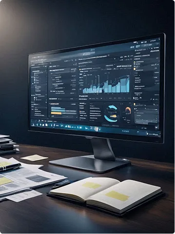
The Shift Toward Performance-First Design
The biggest trend in 2026 isn't visual—it's structural. Performance is no longer a technical afterthought. It's a core design principle that shapes every decision from layout to typography to animation.
Why Performance Matters More Than Ever
Google's Core Web Vitals are now a confirmed ranking factor. Sites that load slowly, shift layouts unexpectedly, or delay interactivity rank lower in search results. But the impact goes beyond SEO. Research shows that a one-second delay in mobile load time can reduce conversions by up to 20%.
Users have zero patience for slow websites. If your hero section takes three seconds to render, half your visitors are gone before they see your value proposition. Performance isn't just about speed—it's about trust. Fast sites signal professionalism and reliability. Slow sites suggest neglect.
How to Design for Performance
Optimize Images Aggressively: Use next-gen formats like WebP and AVIF. Compress images before upload. Implement lazy loading so images below the fold don't block initial rendering.
Limit Custom Fonts: Every font file adds load time. Stick to two font families maximum. Use variable fonts when possible—they offer multiple weights in a single file.
Reduce Animation Complexity: Heavy JavaScript animations kill performance. Use CSS transforms and transitions instead. They're hardware-accelerated and far more efficient.
Minimize Third-Party Scripts: Every analytics tag, chat widget, and tracking pixel adds overhead. Audit your scripts quarterly and remove anything that isn't actively driving value.
Webflow gives you a performance advantage out of the box—global CDN, automatic image compression, and clean code. But you still need to make smart design choices to keep sites fast.
Minimalism with Purpose
Minimalist design has been a trend for years, but in 2026, it's evolving. The focus isn't just on removing clutter—it's on maximizing clarity and guiding users toward action.
What Modern Minimalism Looks Like
Modern minimalism uses white space strategically to direct attention. Every element on the page has a purpose. If something doesn't help users understand your value or move them toward conversion, it's gone.
Key characteristics:
- Clean, uncluttered layouts with generous spacing
- Limited color palettes (2-3 primary colors)
- Simple, readable typography
- Strategic use of contrast to highlight CTAs
- Focused messaging with one primary action per page
Why It Converts
Minimalist design reduces cognitive load. When users aren't overwhelmed by competing visual elements, they can focus on your message and make decisions faster. Research from CXL Institute found that reducing page elements by 40% can increase conversions by up to 30%.
How to Implement It
Start with a Single Goal: Every page should have one primary objective. Design everything around that goal.
Use Hierarchy to Guide Attention: Size, color, and position signal importance. Your CTA should be the most visually prominent element on the page.
Embrace White Space: Don't feel obligated to fill every inch of the screen. Space around elements makes them more impactful.
Simplify Navigation: Mega menus with 50 links overwhelm users. Limit top-level navigation to 5-7 items. Use dropdowns sparingly.
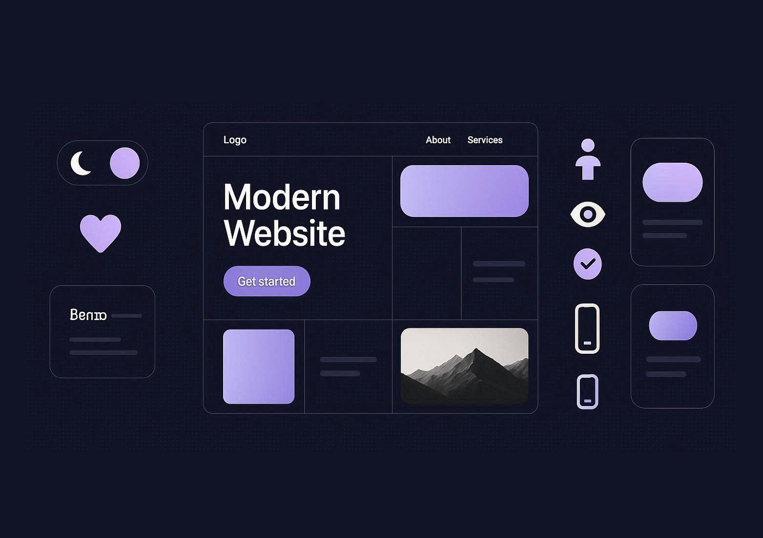
Bento Grid Layouts
Bento grids—modular, card-based layouts inspired by Japanese bento boxes—are everywhere in 2026. They're visually interesting, highly flexible, and perfect for presenting diverse content types in a scannable format.
Why Bento Grids Work
Bento layouts break content into digestible chunks. Each card or tile focuses on one piece of information, making it easy for users to scan and find what they need. This pattern works exceptionally well for:
- Feature showcases
- Portfolio presentations
- Product catalogs
- Resource libraries
- Service overviews
Conversion Benefits
Bento grids create natural visual hierarchy. Larger cards signal importance. Smaller cards provide supporting context. Users can quickly assess the full scope of your offering without scrolling through long blocks of text.
The modular structure also makes responsive design easier. Cards reflow naturally on mobile, maintaining readability without complex breakpoint logic.
Implementation Tips
Vary Card Sizes: Use different sizes to create visual interest and signal priority. Your most important message should occupy the largest card.
Maintain Consistent Spacing: Gutters between cards should be uniform. Inconsistent spacing feels chaotic.
Use Clear CTAs: Each card should have a clear next step—learn more, download, book a call. Don't leave users guessing.
Keep It Scannable: Use icons, short headlines, and concise descriptions. Users should be able to understand each card in 2-3 seconds.
Dark Mode and Adaptive Color Schemes
Dark mode isn't just a aesthetic preference—it's an accessibility and usability feature that users expect in 2026. Over 80% of users enable dark mode on at least one device, and that number is growing.
Why Dark Mode Matters
Dark mode reduces eye strain in low-light environments. It saves battery life on OLED screens. And for many users, it's simply easier to read. Offering dark mode isn't optional anymore—it's table stakes for modern web experiences.
How to Implement Dark Mode
Design with Both Modes in Mind: Don't treat dark mode as an afterthought. Design your color system to support both light and dark variants from the start.
Use Semantic Color Variables: Define colors by function (primary, secondary, background, text) rather than specific values. This makes theme switching seamless.
Test Contrast Ratios: Dark mode requires careful contrast management. Text needs to be readable without being harsh. Use tools like Contrast Checker to validate accessibility.
Respect System Preferences: Use CSS media queries to detect the user's preferred color scheme and default to that. Give users the option to override if they want.
Webflow supports custom color variables and media query-based styling, making dark mode implementation straightforward.
Micro-Interactions and Subtle Animations
Micro-interactions—small, functional animations that provide feedback—are one of the highest-ROI design trends in 2026. They make interfaces feel responsive, guide user attention, and create delight without compromising performance.
What Micro-Interactions Are
Micro-interactions are subtle animations triggered by user actions:
- A button changing color on hover
- A form field highlighting when clicked
- A success checkmark appearing after form submission
- A menu smoothly sliding in from the side
- A card lifting slightly on hover
These animations aren't decorative. They serve functional purposes: confirming actions, signaling state changes, and making interfaces feel more natural and intuitive.
Why They Improve Conversions
Micro-interactions reduce uncertainty. When users click a button and see immediate visual feedback, they know their action registered. This builds confidence and reduces abandonment.
Research from Nielsen Norman Group found that interfaces with appropriate feedback mechanisms have 25% lower error rates and 40% higher user satisfaction scores.
Best Practices
Keep Animations Fast: Micro-interactions should complete in 200-500 milliseconds. Anything longer feels sluggish.
Use CSS Over JavaScript: CSS animations are more performant and don't block the main thread.
Don't Overdo It: Too many animations create visual noise. Use them sparingly on high-impact elements.
Match Brand Personality: Playful brands can use more expressive animations. Enterprise brands should stay subtle and professional.
Webflow's Interactions panel makes creating micro-interactions easy without writing code. You can build hover states, scroll triggers, and click animations visually.
Accessibility as a Design Standard
Accessibility is no longer optional. In 2026, it's a legal requirement in many jurisdictions, an SEO factor, and a conversion driver. Sites that fail accessibility standards aren't just excluding users—they're losing revenue.
Why Accessibility Drives Conversions
Accessible design benefits everyone, not just users with disabilities. Clear navigation, readable text, and keyboard-friendly interfaces improve usability for all visitors. Research from WebAIM shows that accessible sites have 23% higher conversion rates on average.
Accessibility also expands your addressable market. Over 1 billion people worldwide live with some form of disability. If your site isn't accessible, you're excluding a massive audience.
Core Accessibility Principles
Color Contrast: Text must meet WCAG AA standards (4.5:1 for normal text, 3:1 for large text). Use tools like Stark or Contrast Checker to validate.
Keyboard Navigation: Every interactive element must be accessible via keyboard. Test your site without using a mouse.
Alternative Text for Images: Every image needs descriptive alt text. This helps screen readers and improves SEO.
Form Labels and Error Messages: Every input needs a clear label. Error messages should explain what went wrong and how to fix it.
Semantic HTML: Use proper heading hierarchy (H1, H2, H3). Screen readers rely on semantic structure to navigate content.
Webflow generates clean, semantic HTML by default, which gives you a strong accessibility foundation. But you still need to add alt text, manage color contrast, and test keyboard navigation.
Mobile-First and Touch-Optimized Design
Over 60% of web traffic comes from mobile devices, yet many sites still treat mobile as an afterthought. In 2026, mobile-first design is the only approach that makes sense.
What Mobile-First Means
Mobile-first means designing for small screens first, then progressively enhancing for larger devices. This forces you to prioritize content and eliminate clutter. If something doesn't work on mobile, it probably isn't essential.
Mobile Optimization Best Practices
Thumb-Friendly Tap Targets: Buttons and links should be at least 48x48 pixels. Smaller targets lead to misclicks and frustration.
Simplified Navigation: Hamburger menus work on mobile, but make sure your most important links are immediately visible.
Larger Text: Body text should be at least 16px on mobile. Anything smaller is hard to read without zooming.
Fast Load Times: Mobile users are often on slower connections. Optimize aggressively for speed.
Vertical Scrolling Over Horizontal: Mobile users expect to scroll down, not sideways. Avoid horizontal carousels and side-scrolling sections.
Webflow's responsive design controls let you customize layouts for tablet, mobile landscape, and mobile portrait breakpoints. Don't just shrink desktop designs—redesign for mobile usability.
Personalization and Dynamic Content
Generic, one-size-fits-all experiences are losing ground to personalized, context-aware designs. In 2026, high-performing sites adapt content based on user behavior, referral source, location, and previous interactions.
Why Personalization Works
Personalized experiences feel relevant. When a visitor arrives from a LinkedIn ad targeting SaaS founders and sees a headline tailored to SaaS challenges, they're more likely to engage. Research from Epsilon shows that 80% of consumers are more likely to purchase when brands offer personalized experiences.
How to Implement Personalization in Webflow
Conditional Visibility: Show different content blocks based on URL parameters, referral source, or user behavior. If someone lands on your site from a paid ad, show them a message that references the ad's promise.
Geo-Targeting: Display location-specific content. If a visitor is in Germany, show pricing in euros and testimonials from German clients.
Behavioral Triggers: Use tools like Hotjar or HubSpot to track behavior and dynamically adjust CTAs based on engagement signals.
Dynamic CMS Content: Use Webflow CMS to create persona-specific landing pages that pull in relevant case studies, testimonials, and service descriptions.
Personalization doesn't require complex AI. Simple rules-based personalization—showing different content to first-time vs. returning visitors, or tailoring messaging by industry—can lift conversions by 10-30%.
Video Backgrounds and Multimedia Experiences
Video backgrounds aren't new, but in 2026, they're being used more strategically. When done right, video creates emotional connection and communicates complex ideas faster than text.
When to Use Video Backgrounds
Video works best for:
- Hero sections that need to establish brand mood quickly
- Product showcases where motion demonstrates functionality
- Testimonial sections where real people build trust
- About pages that tell brand stories visually
Conversion-Focused Video Best Practices
Keep It Short: Hero videos should loop at 10-20 seconds max. Longer videos increase load time without adding value.
Optimize File Size: Compress aggressively. Use tools like HandBrake to reduce file size without visible quality loss.
Provide Fallback Images: Not all browsers support video backgrounds. Always include a fallback image for older devices.
Don't Auto-Play Audio: Auto-play audio frustrates users and hurts accessibility. If audio is essential, let users opt in.
Ensure Readability: If text overlays video, add a semi-transparent overlay or gradient to maintain contrast.
Video backgrounds can increase engagement by 80% when used appropriately. But they can also tank performance if files are too large. Balance visual impact with load time.
AI-Powered Design Tools and Automation
AI is transforming how designers work. In 2026, AI tools are being used for layout generation, image optimization, copy suggestions, and accessibility audits.
How AI Enhances Design Workflow
Automated Image Optimization: Tools like TinyPNG and Squoosh use AI to compress images without quality loss.
AI-Generated Placeholder Content: Services like Copy.ai and Jasper generate realistic placeholder text for mockups and prototypes.
Accessibility Scanning: Tools like Accessibility Insights and WAVE use AI to detect contrast issues, missing alt text, and keyboard navigation problems.
Layout Suggestions: AI-powered design assistants can suggest layout improvements based on conversion data from thousands of sites.
A/B Test Automation: AI tools analyze user behavior and automatically adjust elements to maximize conversions.
AI won't replace designers, but it's accelerating workflows and removing tedious tasks. Designers who integrate AI tools into their process can deliver faster without sacrificing quality.
Brutalism and Anti-Design Aesthetics
Brutalism—raw, unpolished design with bold typography, stark layouts, and intentional "roughness"—is gaining traction among brands that want to stand out. It's the antithesis of smooth, polished corporate design.
Why Some Brands Choose Brutalism
Brutalism signals authenticity and confidence. It says "we don't need to follow trends—we create our own identity." For brands targeting creative industries, tech-savvy audiences, or younger demographics, brutalism can differentiate effectively.
When Brutalism Works (and When It Doesn't)
Good fit:
- Creative agencies
- Tech startups
- Fashion brands
- Art and culture organizations
Poor fit:
- Financial services
- Healthcare providers
- Enterprise B2B
- E-commerce with broad audiences
Brutalism and Conversion
Brutalism sacrifices polish for personality. It can build brand memorability, but it often reduces usability. If your primary goal is conversion, brutalism is risky. If your goal is brand differentiation and you're targeting a niche, it can work.
Scroll-Triggered Animations and Parallax Effects
Scroll-triggered animations—elements that animate as users scroll down the page—are one of the most engaging design trends in 2026. When used strategically, they guide attention, create narrative flow, and make content feel dynamic.
Why Scroll Animations Work
Scroll animations reward users for exploring your content. They create a sense of progression and discovery. Research shows that pages with scroll-triggered animations have 30% longer average session durations.
Best Practices for Scroll Animations
Use Them to Reveal Content Progressively: Fade in sections as users scroll. This creates a sense of depth and keeps users engaged.
Parallax for Depth: Move background elements at different speeds than foreground elements to create visual depth.
Don't Block Content: Animations should enhance, not obstruct. Never animate in a way that delays access to information.
Test Performance: Scroll animations can be resource-intensive. Test on real devices to ensure they don't cause jank or stuttering.
Webflow's scroll-triggered interactions let you create complex animations without writing JavaScript. You can fade, slide, scale, and rotate elements based on scroll position.
Typography as a Design Statement
Typography is getting bolder, larger, and more experimental in 2026. Oversized headlines, variable fonts, and kinetic type (text that animates) are being used to create visual impact and guide attention.
Trends in Typography
Oversized Headlines: Hero headlines are getting bigger—sometimes occupying 40-50% of viewport height. This creates immediate visual impact.
Variable Fonts: Variable fonts offer multiple weights and styles in a single file, reducing load time while expanding creative options.
Kinetic Typography: Text that animates on scroll or hover adds dynamism without overwhelming users.
Serif Comeback: Serif fonts are returning to digital design after years of sans-serif dominance. They add elegance and differentiation.
Conversion-Focused Typography Tips
Hierarchy is Everything: Your headline should be the largest, boldest element. Subheadings should be smaller but still prominent. Body text should be readable at a glance.
Limit Font Families: Use two fonts max—one for headlines, one for body text. More than that creates visual chaos.
Readable Line Length: Aim for 50-75 characters per line. Longer lines are hard to read.
Adequate Line Height: Body text should have 1.5x line height minimum. Tight line spacing reduces readability.
Interactive and Immersive Experiences
Interactive elements—calculators, quizzes, configurators, and interactive infographics—are becoming standard on high-converting sites. They engage users actively rather than passively, increasing time on site and brand recall.
Types of Interactive Content
ROI Calculators: Let users input their data and see potential results. These work exceptionally well for SaaS and B2B services.
Product Configurators: Let users customize products and see real-time previews. Essential for e-commerce.
Quizzes and Assessments: Guide users toward the right product or service based on their needs. Great for lead generation.
Interactive Infographics: Let users explore data visually. More engaging than static charts.
Why Interactive Content Converts
Interactive content creates investment. When users spend time inputting data or exploring an interactive tool, they're more likely to convert. Research from Demand Metric shows that interactive content generates 2x more conversions than static content.
Implementation in Webflow
Webflow's native interactions handle most UI-level interactivity. For calculators and dynamic tools, you can embed custom JavaScript or integrate third-party tools via iframes or APIs.
The Rise of 3D Elements and Immersive Graphics
3D graphics are moving from experimental to mainstream. Advances in WebGL and rendering libraries like Three.js make it possible to embed interactive 3D models directly into websites without killing performance.
When to Use 3D
3D works best for:
- Product showcases where rotation and zoom add value
- SaaS platforms demonstrating complex interfaces
- Architecture and real estate virtual tours
- Gaming and entertainment brands
Performance Considerations
3D assets are heavy. Use them strategically on high-value pages where they drive conversions. Optimize models aggressively and provide low-resolution fallbacks for older devices.
Final Thoughts
Design trends don't exist in a vacuum. The trends that matter in 2026 are the ones that improve user experience, reduce friction, and drive measurable business outcomes.
Minimalism, performance optimization, accessibility, and mobile-first design aren't trendy—they're foundational. Scroll animations, bento grids, and dark mode are trends with staying power because they solve real user needs.
When evaluating any design trend, ask: Does this help users accomplish their goals faster? Does it reduce cognitive load? Does it build trust? If the answer is no, skip it—no matter how popular it is.
The best designs are invisible. Users don't notice the interface because they're focused on the content and completing their tasks. That's the goal. Not to impress designers, but to serve users and convert them into customers.
Design with purpose. Test relentlessly. Measure results. And remember that the best trend to follow is the one that drives revenue for your business.
%207.png)
Continue reading


%201.webp)
%201.webp)
%201.webp)